Absurd
What is absurd?
"ab·surd (əb-sûrd′, -zûrd′)
adj.
Extremely unreasonable, incongruous, or inappropriate: an absurd request
Impossible to take seriously; silly: a character who goes through many absurd adventures.
Of, relating to, or manifesting the view that there is no order or meaning in human life or in the universe.
Of or relating to absurdism.
The condition or state in which humans exist in an absurd universe, without meaning or purpose. Used chiefly with the."
Research on pinterest
http://pin.it/eF0uiLm
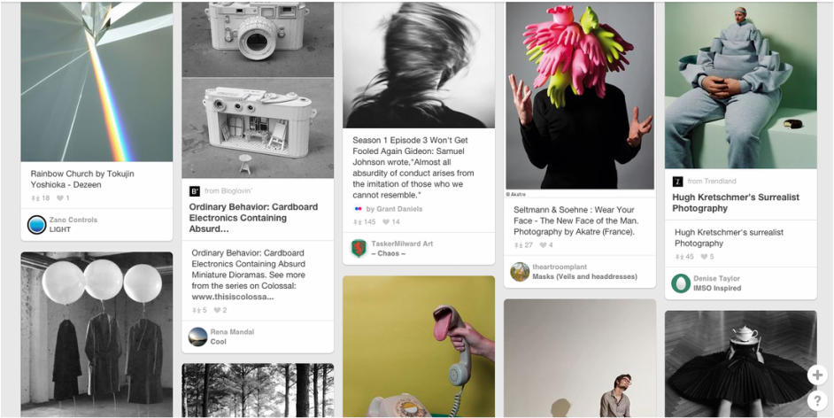
Evaluation of an image I found on pinterest.
|
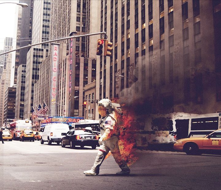
This image particularly peaks my interest because it is most definitely absurd as you would never see an astronaut walking across a city road while on fire.
I like how it almost looks real because the quality is really clear. It also looks as though no one cares that there is an astronaut walking around on fire as if it were normal, also its like the astronaut does not care that they are on fire. The photographer does a good job of making this look absurd because of the background that he/she decided to edit the astronaut into, he further made this look absurd by including the fire. He could have made the dark smoke look less transparent and look a lot more thicker to give it that extra realistic effect. He is also missing out the shadow that the smoke should be displaying on the ground. |
First experiment
|
This is my first experiment of absurd images and the purpose of these images are to make you feel a little uneasy and maybe a little afraid as i wanted to do so. I tried to make it look out of the ordinary, looking sort of freaky and i asked some students what they thought of the image and they said that it was a bit weird to them which means these images achieved their purpose. I really like my composition because you are forced to focus on the weird and emotionless figures as I have angled the camera where the surroundings lead towards the figures, I had also made sure that the background was empty further making you focus on the freaky figures.
For some of my images I did not give enough thought about the lighting which meant the image came out a bit wrong as you could not see the clear detail of the figures, but still i do not mind this as the image still sort of achieves its purpose which is to look weird. |
|


Second experiment
|
For these sets of images i tried to make it look like there was some sort of hiding figure or at least making it so that you would only be able to spot certain limbs, this is to make it odd to look at.
The blunt face on the mannequin also helped to make some of the images look odd as the face is almost difficult to look at. Still i feel as though the images are quite dull and i probably could have added a little more to the background so then it'll look a bit more interesting. |
|


Home experiment


What I was trying to capture here was living things doing something that they shouldn't really be doing for example the right image is of a person with their legs through the sleeves of a cardigan or the left image where a dog is wearing a cardigan and also the middle image of a dog sleeping like a human on a humans bed.
I feel like the images look either too dark or too bright and are a little out of focus which makes the images look a little odd. I also feel as though I could have produced more images as this was not enough to show what I was trying to capture.
I feel like the images look either too dark or too bright and are a little out of focus which makes the images look a little odd. I also feel as though I could have produced more images as this was not enough to show what I was trying to capture.
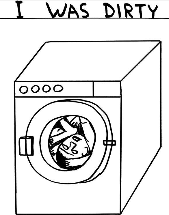
David Shrigley
|
This image i think was intended to be funny and i think he done it quite well
because it shows an image of a person inside a washing machine with a sign saying "i was dirty" which i think is actually quite humorous as it is unusual to see a person try to clean them self using a washing machine instead of bathing/showering. He definitely achieved the theme of an absurd sign since this isn't a normal sign nor is it a sign that you would see everyday. I think he could of added a little more text to maybe make it a little more funny in my opinion, because although it is funny it still seems a bit dull and could use a little more attention to detail like the facial expression on the person in the image. I think there is just a plain white background because it sort of makes you focus on the bold sign and the drawing. |
|
Signs experiment 1
|
|
For this experiment I just came up with some quick signs that might look a bit odd. I tried to make sure that the sign made sense with its background so then the sign wouldn't seem pointless but while not making much sense as well.
I also tried to add some humour behind my signs as it was inspiration I got from David Shrigley's work. I made sure that my composition was set properly so that the signs didn't look odd with its background. I will definitely recreate some of these images but with some better signs with images so that there is more detail added behind the signs. |


Signs experiment 2
|
For this experiment I created some better signs with some mini symbols and images to help the image come to life and make it a little more humorous.
I decided to and images and symbols onto my signs since my inspiration was David Shrigley and he mostly uses pictures to link with his quirky signs. If I could I would've set up some of my images outside but the wind kept on blowing the signs away meaning my images had to be done inside. I really liked the theme that I kept with the speech bubble images because it seems odd and a little funny at the same time. Its odd because I used objects and animals that can't talk so the I stuck the speech bubble next to them to make it seem as though they are talking in the images. |
|


Other experiments
|
|
When I was taking these images I was trying to make it look as though the little munny's were following my models. I tried to put about an eerie tone so that the image may feel odd to look at. I also tried to create a story with my images so the sense that my models were being followed felt a bit stronger. To make the tone of the images that more eerie I could have set the images at night which would also probably give the images a darker tone as well.
|


Forced perspective
For the first two pictures I tried to make it look as though these people were just standing or sitting down when they really wasn't they are actually in fact laying down standing against a bench and sitting the opposite direction on stairs.


Force perspective edited
|
To create these images I used photoshop to make it seem as though the person is really small or really big. I also made sure that my composition was set at a certain angle and distance when I was taking the pictures to further make the finished photoshopped image look real.
|
|


Jacob sutton
|
Jacob sutton is a professional photographer who likes to create a lot of his own experiments. For example he has managed to take those 4 top pictures underwater also making the images black and white which gives it a really nice shadow effect. All these images also show that lighting can stand out really well in black and white. I really like the way contrast is used in these images like how the light shines around the silhouette on all the objects around it. For example the image on the bottom right shows this really well with the light shining on all the smoke in the background making the person become a sort of shadow silhouette.
|
|


|
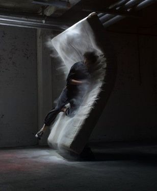
The photographer has managed to create a nice balance of contrast between the dark and the light as the right half the image is just dark and then the left side or the image is bright or more lighter. I particularly like how the light is also shining on to the dust particles that are bouncing off the mattress as I feel as though it adds a really nice effect. I also think that the light is centred so that the main focus of the viewer is to be there.
I believe that the photographer had used an artificial light when taking this image as again its seems very focused towards the centre but it could be natural lighting shining from a window in the ceiling. |
|
Further experiments
|
|
To do this experiment I got some inspiration from Jacob Sutton's work and tried to recreate it in my own way using what I had at my disposal. I made sure that I composed my images well enough so that I had captured the contrast how I wanted it to be. I put my model and the light behind a huge piece of thin material to make it look as though you were still able to see the silhouette of the model.
|


Photoshopped experiments


Shadow experiment


For these pictures I used the same equipment I had when doing my further experiments but this time I had decided that I wanted take the pictures in black and white to give it a bit of a scary effect. I composed everything so that the lighting was angled at the correct position, this would help to create the shadow effect that I also wanted. The point of these images is make it uneasy to look at which I feel I had accomplished but I still feel that more needs to be done. I also feel as though the background is more brighter than I wanted it to be but this was due to the equipment I was using as I couldn't move the screen somewhere darker because it was too large to be moved anywhere else. These images show emotionless shadows with still poses that make the images seem a little nerving to look at.
I'd describe the images as a bit nerve wrecking
I'd describe the images as a bit nerve wrecking
Photoshop for final experiment
Photoshop experiments


For this project I researched an artist called Jacob Sutton and I first discovered him when looking on pinterest and I learned that I have to keep on doing random experiments until it eventually just works because most of his work were mainly his own experiments. I also realised that good lighting can help to give an image a nice tone and contrast, lighting also helps when trying to get people to focus on a silhouette. The theme that I had explored was a mixture of absurdity and contrast. At first I thought I'd just give it a little try and it turned pretty well but in my eyes it wasn't really how i wanted it to be.
Because of that I had ended up taking some more pictures but this time I took them in black and white to give it a sort of darker tone, changing it to black and white also really helped to capture the contrast that I wanted as well. Once I had finished taking the pictures I decided that I wanted to make them look more absurd by making it look more scary and odd to look at so I used photoshop to merge a couple of the images together and used the smudge tool to make it look a bit more odd as it sort of looks like the silhouettes and shadows have been moved out of place. I had also made the images a little less bright and increased the contrast. The only real challenging thing that I had ran into was removing some of the background as I didn't really want it there but it ended up alright so I left it in.
Because of that I had ended up taking some more pictures but this time I took them in black and white to give it a sort of darker tone, changing it to black and white also really helped to capture the contrast that I wanted as well. Once I had finished taking the pictures I decided that I wanted to make them look more absurd by making it look more scary and odd to look at so I used photoshop to merge a couple of the images together and used the smudge tool to make it look a bit more odd as it sort of looks like the silhouettes and shadows have been moved out of place. I had also made the images a little less bright and increased the contrast. The only real challenging thing that I had ran into was removing some of the background as I didn't really want it there but it ended up alright so I left it in.
Final piece
|
for these final images i decided to go back to me shadow experiments but this time I had come up with better composition and had asked the people that were modelling for me to do actual poses that I had come up with.
I had also decided to make the images a lot darker because I thought that it made the image look more appealing. I also tried to change the background so that I could achieve better contrast but the frame that I was using restricted me from changing the location that I had previously used this meant that I had to try and work with quite a bright background. Again I tried to make the images look rather scary as I was trying to go for a sort of horror theme which is why I wanted to take pictures of the shadows as they are expressionless. |
|


